Welcome to this look at the Divi Theme and its customizer settings. A fitting review for a beginner or a seasoned enthusiast looking to enhance your skills. Divi Theme customizer settings are a powerful set of tools for creating stunning, user-friendly websites. But, under the hood of Divi’s customizer settings, the secrets to crafting a website may not be as easy as it seems.
We’ll explore the not-so-intuitive interface of Divi, where customization enhances incredible outcomes. Where a little effort up front pays in big rewards. Our focus will be on empowering you, the creator, with the knowledge to use Divi’s versatile features effectively.
From tweaking the layout to perfecting the typography, each step is designed to enhance your website’s aesthetic and user experience.
This guide promises to be your trusted companion in mastering the Divi Theme Builder, setting the stage for you to unleash your creativity and build a digital presence that stands out. So, let’s get started and unlock the potential of your website with the power of Divi!
Understanding the Divi Theme Builder
Divi Theme Builder is a powerful tool for creating websites. It’s part of Divi, a popular WordPress theme created by Elegant Themes. Just like you can build anything with a box of Legos, Divi lets you build any kind of website you want. With a drag-and-drop interface, block editing, and the ability to perform complex customizations. It’s cool that you don’t need to know how to code.
Most everything can be done with just clicks and drags. This makes it perfect for people who are new to making websites. Divi Theme Builder is special because it lets you change how your website looks and feels. Both visually and inside the builder. You can decide where things go on your site.
One great thing about Divi is that it’s easy for beginners. If you’ve never made a website before, Divi is a good place to start. With Divi, you can make your website look exactly how you want, and you don’t need to be a computer expert to do it.

Getting Started with Divi Theme Customizer
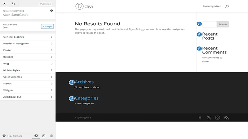
To start using the Divi Customizer, first, you need to have installed and activated the Divi Theme. Once you’re in, look for ‘Divi’ on the left side menu. When you click on it, you’ll see an option that says ‘Theme Customizer.’ You can also Appearance>Customize in the left side menu.
This is the Divi Customizer. It’s like the control room for your website. Here, you can change layouts for the header and footer elements, colors, Typography, and many other settings. The page shows your website on the right and will reflect, where possible, any changes made to settings on the left.
Let’s talk about what you see in the Divi Customizer. At first, there are lots of things to click on, but it’s simple once you know what they do. The most used parts are ‘General Settings,’ ‘Header & Navigation,’ and ‘Footer,’. ‘General Settings’ is where you will find settings for your logo, Typography, background, and layout settings.
Header & Navigation handles the format and elements of the header section. You can adjust the primary and secondary menus here as well as fixed options. These settings are your tools to make your website look just how you want it.
Customizing Your Website Layout
Here we are going to go into a little bit of detail about your settings options.
Header & Navigation Settings
Creating a great header is key to making a lasting first impression. In Divi Theme Builder, the header is not just a static part of your site; it’s a dynamic feature that sets the tone for your entire website. Let’s delve deeper into customizing headers and navigation to ensure your site is both appealing and user-friendly.
Customizing Headers
Think of your header as the welcoming face of your website. In Divi, you have the power to design headers that are not just visually appealing but also reflective of your brand’s personality. You can choose from a variety of layouts, adjust sizes, and even incorporate unique elements like your logo or a custom graphic.
- Header Format: Starting with the header style you can choose to use the default, Centered, Centered Inline Logo, Slide In, or Full screen. As you can see in the menu there is an option to ‘Enable Vertical Navigation’. When selected each header style selection will also influence that layout. Go ahead and play with them. You can also choose to hide the menu until the user begins to scroll. A handy feature when keeping the emphasis on the landing page CTA or hero elements. When you’re done and find what you like don’t forget to ‘Publish’.
- Interactive Header Elements: Add interactive features to your header, like a search bar, social buttons, contact details, or a call-to-action button. These elements are not only functional but also encourage visitor engagement.
- Sticky Headers: A sticky ( or fixed ) header stays at the top of the page even as visitors scroll down. This feature in Divi ensures that your navigation is always accessible, enhancing the user experience. It can be a very useful setting for single-page websites that have navigation links to specific sections. Keeping the menu and flow always available.

Enhancing Navigation
Your website’s navigation should be straightforward and intuitive. Divi allows you to create menus that are easy to navigate, ensuring visitors can find what they’re looking for without confusion. Thankfully there are plenty of options available to fine-tune your menus.
- Primary Menu: The most important menu settings are those that the user will see first. The primary menu bar. This menu setting section can allow for adjustments of the Menu width, height, Text and Logo sizes, fonts, and colors. You will want to spend the time here to make sure your settings are on brand, easy for users to interact with, and of course, looks great too!
- Secondary Menu: If you are choosing to use a secondary menu, then these settings will be required to make adjustments. These settings are nearly the same as the primary menu so should be on-brand and easy to navigate.
- Mega Menus for More Content: For sites with a lot of content, mega menus are a great feature. They expand to display grouped navigational options that are more open to the screen. Instead of level-by-level dropdowns. This is great for helping visitors to navigate through large amounts of information easily. However, it’s not easily apparent that mega menus are even an option in Divi. While the mega menu is natively supported you have to do some extra customization settings to achieve this. See Elegant Theme’s step-by-step for Divi’s Mega Menu feature.
Customizing headers and navigation in Divi is about balancing aesthetics with functionality. A well-designed header and intuitive navigation not only make your site look professional but also enhance the overall user experience. With Divi’s flexible customization options, you can create a header and navigation that perfectly aligns with your brand and meets your audience’s needs.
Styling with Divi: Colors and Typography
Choosing colors for your website is like picking out paint for a room. It’s all about staying on brand or creating the right mood. In Divi, you can play with colors to make your website feel just how you want it. Maybe you like bright and cheerful colors, or maybe you prefer something more calm and cool. Whatever you choose, it’s easy to change colors in Divi. You can pick colors for your background, your text, and even your buttons.
There are many different colors you can modify in Divi. If we just stroll down the Divi theme customizer list we can start with the ‘General Settings’. Under the layout sub menu, you can change the ‘Accent Color’. This will change the accents found in widgets and areas that are ‘hardwired’ into the theme. List items in widgets for example.
The typography section can of course color and style your text. Headers and body text can have their colors, fonts, and sizes. This is also true for
- primary, and secondary menus.
- Footer Widgets, Footer Menu, and Footer Bottom Bar
- Buttons and Blog Post Settings.
Typography is just a fancy word for what your writing looks like. In Divi, you can choose different fonts, which are like different handwriting styles. You can also change how big or small your text is. This is important because you want your words to be easy to read.
Good typography makes sure your website’s text is friendly to the eyes. You can play around with font styles and sizes in Divi to make sure your website’s words are just as beautiful as its design! All these settings can be changed in the areas mentioned above.
Enhancing Your Website’s Functionality
After making your website look nice, it’s time to add some cool features. In Divi, these are called widgets and modules. Widgets are like little helpers. You can add them to your sidebar or footer. They can do things like show your latest posts, let people search your site, or even display your tweets. The possibilities are only restricted by what’s available in your theme’s advanced features and plugins installed that offer widgets.
Advanced Customizer Features
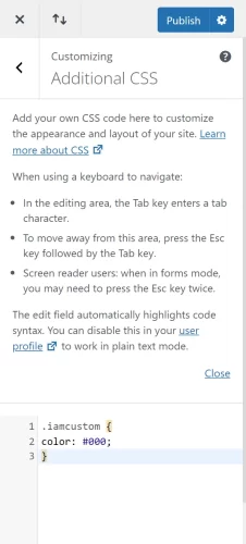
The Divi Theme Builder offers a world of possibilities for customizing your WordPress site, and the Additional CSS section is a key component of this flexibility. This feature is incredibly useful for those who want to push their website’s design further than what the standard options allow. Think of it as having a magic wand that lets you fine-tune your site’s appearance and behavior with precision.

The Necessity of Additional CSS
- Personalized Styling: While Divi provides extensive styling options, Additional CSS lets you create unique styles that make your site stand out.
- Responsive Tweaks: Sometimes, you need to adjust how elements look on different devices. CSS gives you the control to make your site look great on any screen.
- Performance Enhancements: Efficient CSS can also help your site load faster by overriding default styles that might be slowing it down.
The Usefulness of Additional CSS
- Overcoming Limitations: When you hit the limits of Divi’s built-in options, CSS lets you go beyond, offering customization at a granular level.
- Consistency Across Pages: Use CSS to apply consistent styling across various pages without repeating the settings in the Divi Builder for each element.
- Animating Elements: CSS can bring your site to life with animations and transitions, dynamically engaging your visitors.
Best Practices for Using Additional CSS
- Keep it Organized: Comment your CSS code so you know what each section does. This makes it easier to make changes later.
- Start Small: If you’re new to CSS, begin with small changes. Gradually build your skills before attempting complex styling.
- Test Responsively: Always check how your CSS affects your site on different devices to ensure a consistent user experience.
- Optimize for Performance: Write clean, efficient code. Overly complex CSS can slow down your site.
- Backup Regularly: Before making significant changes, back up your site. This way, you can restore it if something goes wrong.
- Stay Updated: CSS standards and best practices evolve. Keep learning and stay updated to ensure your site uses modern techniques.
Incorporating Additional CSS into your Divi Theme Builder workflow opens up a new realm of customization possibilities. It empowers you to craft a site that not only looks unique but also functions seamlessly across all devices. Whether you’re tweaking a few styles or overhauling your site’s design, the Additional CSS section is an invaluable tool in your Divi arsenal.
Another powerful feature in Divi is the ability to add custom JavaScript. This is worth mentioning because it does have a very similar utility to an additional CSS section. However, we’re not going to cover that here since it is not integrated into the ‘customizer’ settings but instead the ‘theme options’ which we will cover in later posts.
Best Practices for Using Divi Customizer
When you’re designing your website with Divi, it’s like being both an artist and a scientist. You want your site to look good, but it should also work well. Here are some best practices to keep in mind. First, aim for a consistent design. This means using the same colors and fonts all through your site. You want your website to have a style that’s all its own. This makes it look professional and easy on the eyes.
Next, find the right balance between creativity and usability. Sure, it’s fun to try all sorts of fancy designs, but always think about your visitors. You want them to enjoy your site and find what they need easily. It’s like throwing a party. You want it to be fun and interesting, but you also want your guests to feel comfortable. What looks great on Desktop may not look great on mobile and visa versa. Check regularly. Using all the available Divi theme customizer settings we’ve discussed above you can spend worthwhile time creating the vision.
Common Challenges and Solutions
Even with a great tool like Divi, you might run into some challenges. Don’t worry, this is normal when you’re learning something new. Here are some common issues and how to solve them.
First, sometimes things might not look right on your site. Maybe the layout is off, or the colors don’t look how you expected. Double-check your customizer settings. Make sure you’ve saved your changes. Another tip is to clear your browser cache. Sometimes your browser shows an old version of your site. Clearing the cache can show you the latest version. Also, review your site for features you don’t need. It’s like cleaning out a closet. Keep what’s necessary, and remove what’s not.
Lastly, if you’re stuck or need more help, the Divi community is a great resource. There are forums and groups where you can ask questions. It’s like having a team of helpers. Other Divi users and experts can offer advice and solutions. You can learn a lot from them. Plus, it’s a great way to meet other people who are also using Divi.
Remember, building a website is a journey. There’s always something new to learn. With Divi, you’re part of a community, and there’s plenty of help along the way. Keep experimenting, and you’ll keep improving!
Conclusion
We’ve seen the depth of the Divi Theme customizer settings. We’ve seen how it can transform your WordPress site. From the basics of layout and typography to the more advanced features like custom CSS. Like all great themes, Divi offers a vast playground for creativity and functionality.
Remember, building a website with Divi is a learning process. It’s okay to start small and grow your skills over time. Every feature you master and every challenge you overcome makes your website better and more unique. Your website is a reflection of your vision, and with Divi, you have the tools to make that vision a reality.
So, go ahead and experiment. Try new designs, play with colors, and test different layouts. With each step, you’ll gain confidence and expertise. And, if you ever feel stuck, the Divi community is always there to help, full of fellow creators eager to share their knowledge and experience.
In closing, embrace the journey of website creation with Divi. It’s not just about building a website; it’s about bringing your ideas to life and sharing them with the world. Happy creating!


